[no_toc]
This is going to be an interesting week and a very volatile one with all the fundamental news coming.
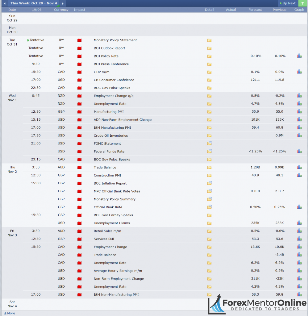
Source: https://www.forexfactory.com/calendar.php?week=oct29.2017
EUR USD
Last Thursday Mario Draghi sent the Eur/Usd to a new low after 4 months. The ECB decided to cut QE purchase volumes from 60 Billion Euros to 30 Billion. At the same time, it looks like the QE will extend from ending in December 2017 to September 2018.
Strong data from the USA, with advanced GDP coming out at 3% vs. the expected 2.6% also contributed to the USD strength.
Now, let’s take a look at supply & demand analysis to see what exactly happened & next possible levels.
Looking into the past, on 27 of August 2017, Eur/Usd broke 2 years high of 1.17164.
Imidetaly after breaking 1.17164, Eur/Usd created a new demand zone between 1.16500-1.16885 which held the price up for almost 4 months until Thursday.
EUR/USD Daily Chart:
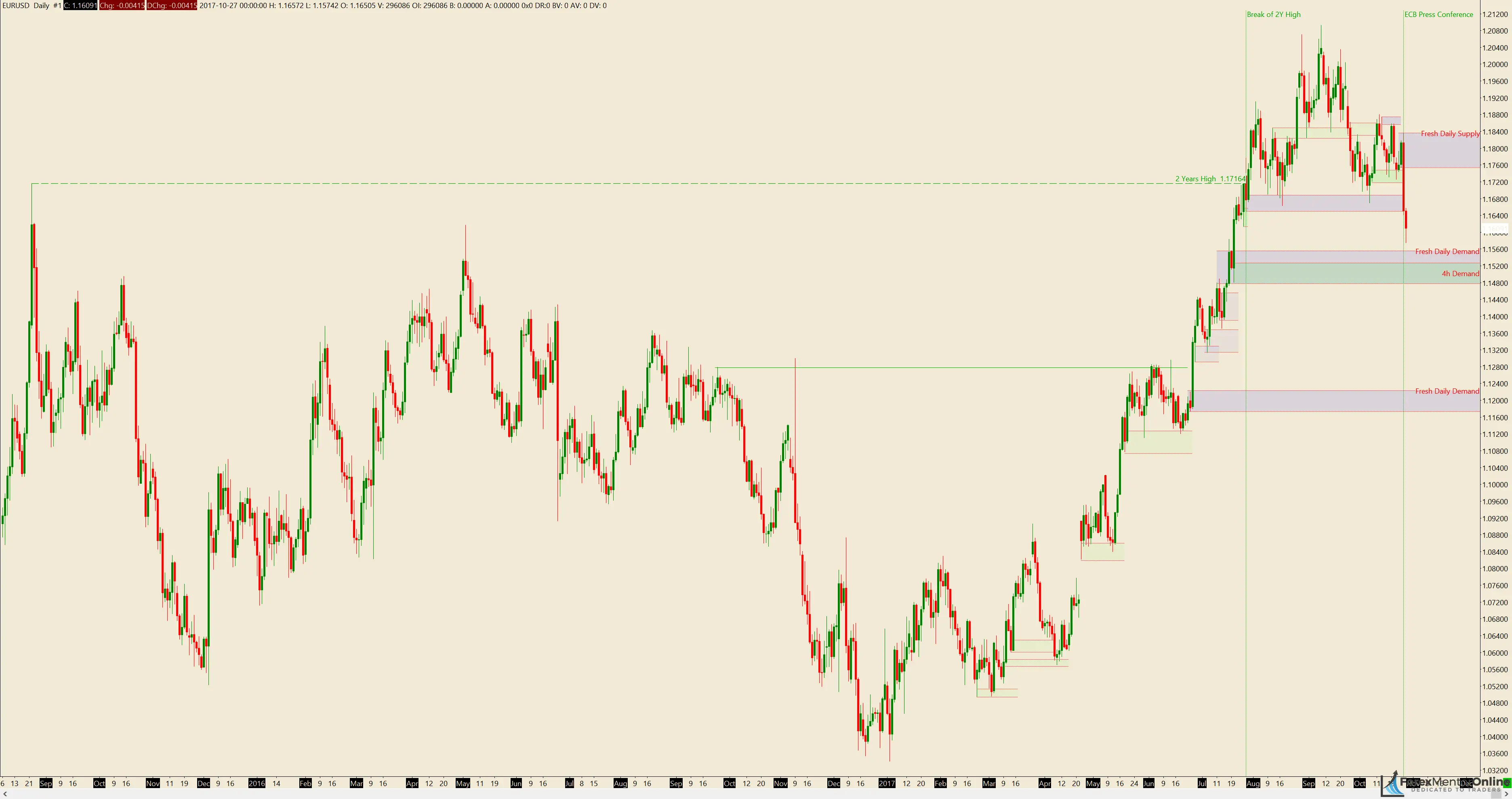
(Note: The above pic is a resized image, to download/view the 4k (3840 x 2160) of the same image, click on picture)
An H&S pattern also completed forming with the ECB new low on Thursday.
Next fresh supply zone on EUR/USD Daily chart seems to be around
- 1.17535 – 1.18365.
Next fresh demand zones on EUR/USD Dailly chart:
- 1.14780 – 1.15560
- 1.11730 – 1.12230
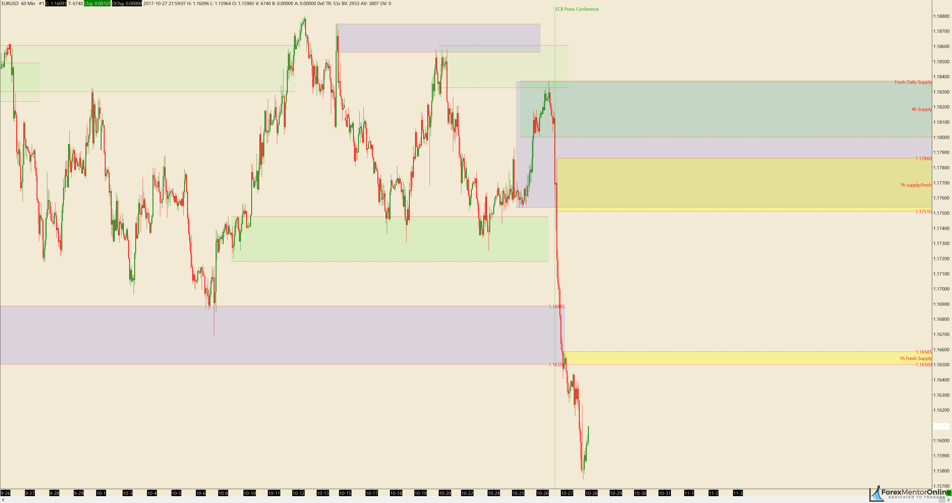
EUR/USD 4H Chart

(Note: The above pic is a resized image, to download/view the 4k (3840 x 2160) of the same image, click on picture)
On the 4H chart, we can see a better picture of the price and the demand zone between 1.16500-1.1688 which held the price up.
Next fresh supply zone on the 4h EUR/USD chart seems to be:
- 1.18000 – 1.18370
In my opinion, this seems to be the only fresh Supply zone on the EUR/USD 4h Chart. All the rest have been consumed, tested once.
Next fresh demand zone on the 4h EUR/USD chart seems to be:
- 1.14775 – 1.15260
- 1.11730 – 1.12230 (same as the daily demand)
EUR/USD 1h Chart
Usually, I don’t analyze 1h charts, but this one is worth noting.
(Note: The above pic is a resized image, to download/view the 4k (3840 x 2160) of the same image, click on picture)
Eur/Usd 1h chart comes with 2 very interesting zones. I am talking about 2 fresh supply zones for potential shorts.
The 1st zone is above, at 1.17510 – 1.17860. The reason why I think this is important is that this zone is in confluence with the daily supply at 1.17535 – 1.18365.
The 2nd zone is at 1.16500 – 1.16585. The reason why I think this is important is that this looks like a fresh supply to me. If you notice the 1.16500-1.16885 zone, it is the zone which we talked previously, the zone that held Eur/Usd up for a very long time.
On Thursday that zone broke and made a new supply at 1.16500 – 1.16585 which pushed the price lower.
Next week fundamental news
This is going to be an interesting week for Eur/Usd.
Two most important event for the coming week is FOMC and NFP payrolls.

To get a detailed view of next week upcoming fundamental news, check Forex Factory calendar.
Eur/Usd Trade Ideas:
In my opinion, right now the Eur/Usd is in the middle of nowhere & I would stay out. If you’re looking for trade ideas, I would suggest waiting for price to come into our area of interest (4h and Daily levels preferred)
Thanks man your analysis are gud clear supply and demand zones clearly marked
Glad you liked it 😀
Hello guy! It is so detail and useful . Everyone can applies and reaping benefit immediately.
I bought all your Ebooks. It is THE BEST
thanks alot!
Thank you Nguyen.
Glad you like em both 🙂
This new website looks marvelous, The supply and demand too are clearly visible. I like it!
I am glad you like it Sello 😀
Good analysis, Cheers
Hi,
I am very glad you’re back with your analyzes. But I’m a litte bit confused and have 3 questions therefore:
1. Your draw the supply and demand zones in a different way as you teached in your arcticle “how to easily draw supply and demand zones”. What is the rational behind this change?
2. In your older analyzes you always analyzed the daily and the one hour chart. Now your wrote you wouldn’t analyze the one hour chart usually. What changed your mind?
3. In one of your books (I don’t no in which one at the moment) your wrote demand and supply zones are only valid for a certain time. For the daily chart round about a month and for the 1 hour chart round about 24 hours. Now you use much older zones, what are the arguments for this?
I’ve found two arguments for this differences.
Either you changed your mind in these aspects of analyzing supply and demand or you are another person than the “old” forexmentoronline.
I guess it’s the second one and you are one of the new article authors. .
Thats’s no problem at all, but it would be easier to understand if one knows who the author is.
Sincerely
Joachim Werner
Hello Joachim,
Let me clarify all your questions 😀
First let me answer your questions then tell you who I am.
1.It is true. I draw the zones the same way as described in that article with the only difference that I prefer to start from weekly down to 4h/1h, the so called “Top Down Analysis”
2.I do analyze 1h charts but only mention them when there is a good zone to watch.Sometimes it takes a lot of times as well to analyze every pair down to 1h and that’s why I prefer to keep it to 4h.
3.That doesn’t change. It is still valid. The only thing I failed to mention is that I prefer to watch price around those zones and make trades if fresh supply/demand forms on those areas. I will fix this on the next article.
You guessed right. I am new to writing articles but not to trading. I’ve been involved in Forex since 2009.
Maybe next time I will publish the article under my own author name here.
Let me know if you have any other question.
Tim
Hi Tim,
thanks for your answer. But I think you draw your zones different as mentioned in then article. In the article the zones are drawn from the OPEN of the last bullish candle befor the drop to the high of the supply zone and from the OPEN of the last bearish candle before the push up down to the low of the zone.
When I look at your charts, you use another method to define the zones.
That’s not a critic, but I’m interested in your method.
Greats
Joachim
Hello Joachim,
Your feedback is welcome, be it good or bad.
The way I draw the zones comes down to personal preference and experience.
Let me show you 3 good examples.
Example 1:

In this trade,the supply level looks very nice and lean.
If you go by the open rule, you would miss a good trade, if you include the wick (low in this case) too, which was very tight in this case, you would get into a very good trade
Example 2:

In this example we can see 2 trades.
One which came to the wick but not the open price,as the above example and one which came down to the open.
Example 3:

Price came to the open price before doping…
To sum it up, you can draw just using the “Open” or include the “Wick” (high/low) too. It comes down to personal preference and risk reward as well.In some cases where the wick is very big, it is better to avoid that level completely.
The article is a good starting point for beginners since it gives you lower risk technically by using the “open” in case that a trade fails… but you can take it from there and improve/adjust it to suit your own style.
Also, the HTF levels I draw above are only for reference and not tuch trade. It is better to wait for fresh levels to form around those zones and then make the decision to trade or not.
Tim
Hi Tim, thanks for your answer.
In your first example you are right and with the first zone in the second example. The second zone in the second example would be bigger if one uses the open of the bearish bar before the bullish bar you used. Also in your third example. Using the open of the bullish candle at the very left (the last bullish candle before the drop) would result in a greater zone.
But like you wrote, it’s a matter of preference.
I agree with you, zones can not be used for “blind” trading. It’s necessary to watch the price action before and when the zone are touched and the price action in between the zones and how price leaves the zones.
Looking forward to your next article.
Joachim
(Y)
I really like the new website
Thanks for the feedback Zonke 😀
Please I wasn’t able to download the indicator for drawing supply and demand zones on mt4. It says the file could not be found. Is there any way you repost the link? I really love your analysis. I’m new to trading supply and demand zones. I observed the zones mentioned in your article this week and they were all spot on. Thank you
Which indicator are you referring to? Can you show/send me the link please?
Thank you
I can’t copy the link. I found it in one of your articles, “how to draw supply and demand zones easily” dated April 2016.
Link updated and fixed.
You can find the corrected link on that article or download it here
I just downloaded the indicator. I followed the instructions to install it the MT4 on my Mac, but it didn’t show on my
Charts. Any idea what the problem might be?
Maybe because it is on MAC
Try it on a pc
Also, as I mentioned on that article “This isn’t the type of indicator which will automatically draw the supply and demand zones on your charts, ( it can but it doesn’t mark the right zones ) but it does have some other little features which come in handy when drawing the zones and when trading the zones.”
“One of the features of this indicator is when a zone you have drawn has been touched, the zone itself will change color to let you know the zone has been touched. ”
Maybe try again when the markets open on Monday.